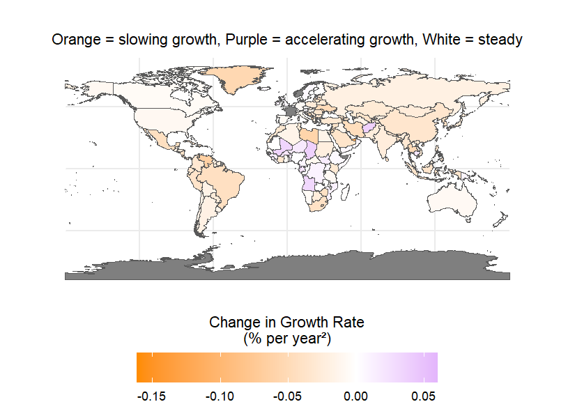
Did you know that most countries in the world are experiencing slowing population growth while parts of Africa continue to see accelerating growth due to higher fertility rates and younger populations.
The map shows the long-term trend of population growth rates in each country. The color gradient represents the annual change in growth rate in percent per year squared. Orange indicates slowing growth white indicates steady growth and purple indicates accelerating growth. Countries with a negative growth rate representing shrinking populations are included and the gradient indicates whether their decline is speeding up or slowing down.
Data source: Map was created using World Bank Population Data.
*These figures have not yet been formally peer reviewed and are intended as exploratory